The gracElvin Symbol
An entry about sketching simple logo designs for GracElvin, noticing how lines can hold meaning, and arriving at a symbol that feels lasting enough to carry beyond the page.
12/30/20251 min read
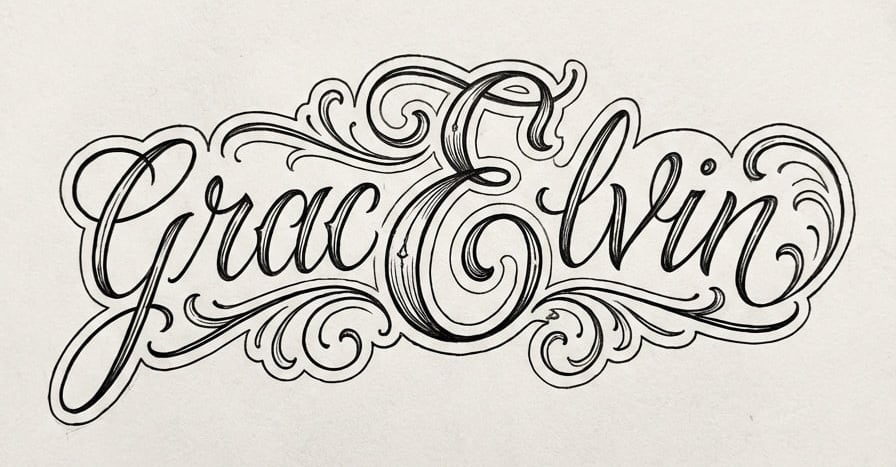
I spent time this week sketching ideas for the GracElvin logo, letting simple shapes take form without forcing them. A G and an E, drawn and redrawn, shifting slightly each time until they felt settled. What surprised me was how quickly the process became less about design and more about meaning.
There is something honest about working with lines. They are either intentional or they are not. They either hold or they drift. As the design became clearer, it started to feel less like something made for a website and more like a symbol of what we are building.
At some point, the thought crossed my mind that this mark might live beyond the page. Not as decoration, but as something carried. A reminder chosen on purpose. The idea did not feel impulsive or dramatic. It felt steady.
That is how I know it matters. Some symbols earn their place slowly, and when they do, you recognize them as something you want to keep.
Subscribe to our newsletter
Educational Purpose & Use Disclaimer
This website is maintained as part of an educational and skills-based learning project developed in conjunction with Waking Girl Web Design and the Win Room School House. All content, design, and development activities are intended for instructional, educational, and experiential learning purposes only.
Any names, images, likenesses, personal references, or narrative elements appearing on this site are used solely within the context of learning, creative expression, or portfolio-based education. No content on this website is intended for commercial solicitation, data harvesting, surveillance, investigation, harassment, misrepresentation, or any form of adversarial use.
This website is not to be used for monitoring, profiling, intimidation, coercion, evidentiary collection, or to support third-party claims, disputes, or actions. Unauthorized use, reproduction, scraping, or mischaracterization of content is expressly prohibited.
Participation in the creation or maintenance of this site does not constitute employment, agency, legal representation, or the provision of professional services. Privacy and safety considerations are prioritized, and any misuse of this website or its content contrary to its stated educational purpose is not permitted.