Lines that hold meaning
A reflection on designing a logo for GracElvin and choosing marks that are meant to last.
11/27/20251 min read
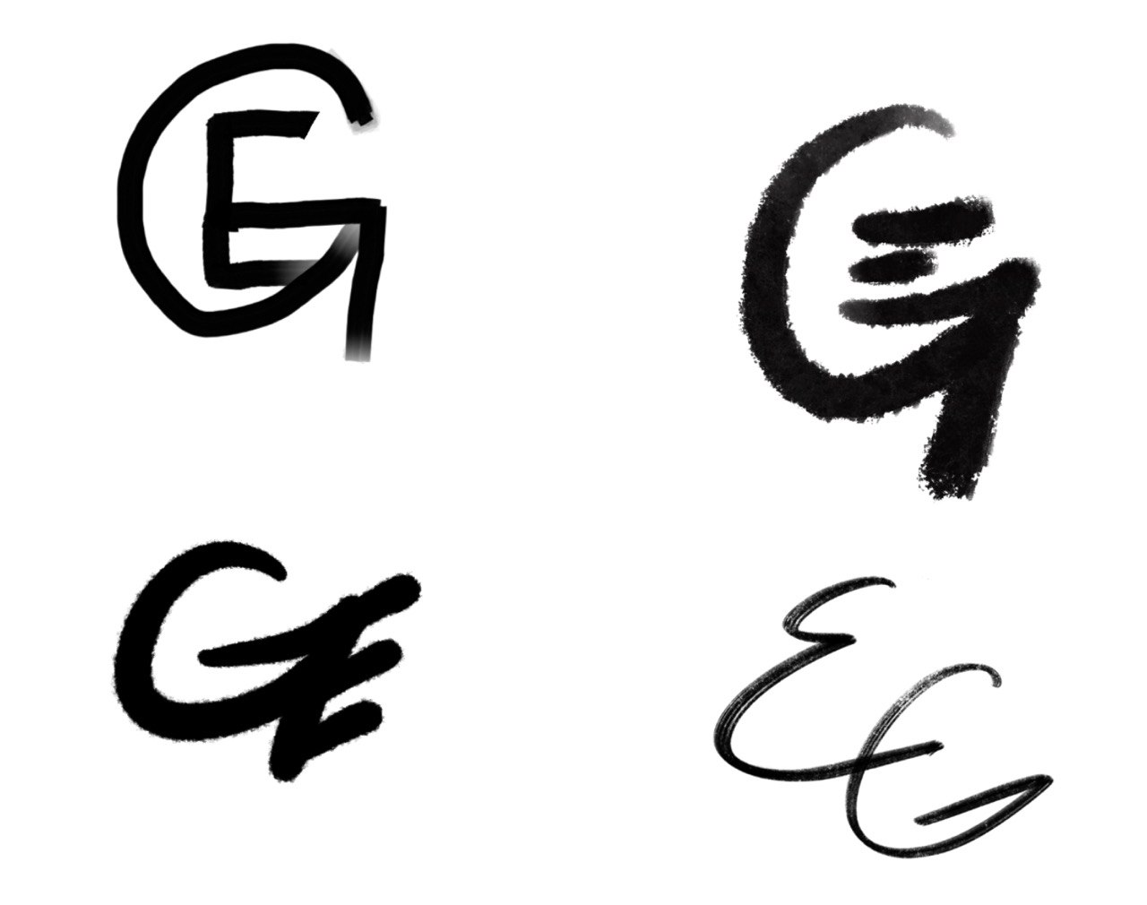
Lately I have been thinking about symbols and why we return to them. This website has a name, and now it is beginning to want a mark of its own. I keep sketching ideas for a logo, letting a G and an E find their way toward each other on the page.
It is a slow process. I am not looking for anything flashy or ornamental. I want something simple enough to last. Something that feels like us without explaining us. Two letters, distinct, but no longer separate. The kind of design that only makes sense once you stop trying to decorate it.
I like the idea that a mark can quietly carry meaning. That it can sit with you over time and become more than what it was at the beginning. Some things are worth choosing carefully, even if no one else ever notices the difference.
This feels like one of those things.
Subscribe to our newsletter
Educational Purpose & Use Disclaimer
This website is maintained as part of an educational and skills-based learning project developed in conjunction with Waking Girl Web Design and the Win Room School House. All content, design, and development activities are intended for instructional, educational, and experiential learning purposes only.
Any names, images, likenesses, personal references, or narrative elements appearing on this site are used solely within the context of learning, creative expression, or portfolio-based education. No content on this website is intended for commercial solicitation, data harvesting, surveillance, investigation, harassment, misrepresentation, or any form of adversarial use.
This website is not to be used for monitoring, profiling, intimidation, coercion, evidentiary collection, or to support third-party claims, disputes, or actions. Unauthorized use, reproduction, scraping, or mischaracterization of content is expressly prohibited.
Participation in the creation or maintenance of this site does not constitute employment, agency, legal representation, or the provision of professional services. Privacy and safety considerations are prioritized, and any misuse of this website or its content contrary to its stated educational purpose is not permitted.